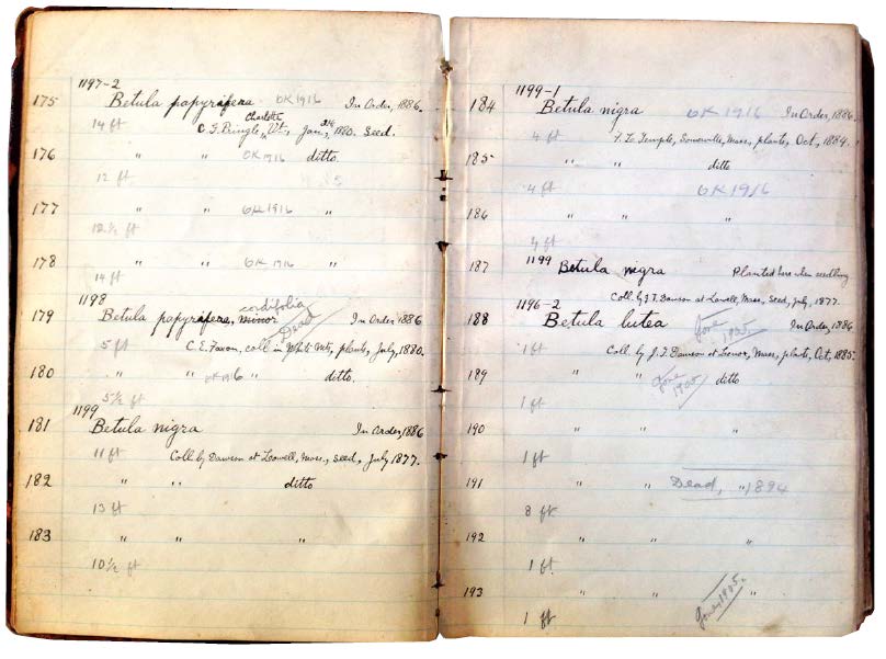
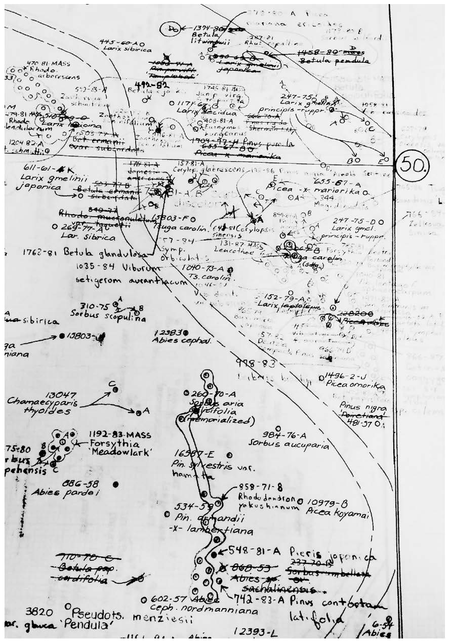
While traversing the accessions data of Harvard University’s Arnold Arboretum, one of the largest and most well-documented living collections of trees, vines, and shrubs in the world, I came across the record for a cherry tree, Prunus sargentii, named for its collector, the botanist Charles Sprague Sargent. The data suggest that this specimen was retrieved by Sargent on an expedition to Japan in 1940. Yet Sargent died thirteen years earlier, in 1927. How might we decipher the convoluted origins of this tree: uprooted from Japan and planted in US soil on a timeline that makes little sense to an outsider?

In the collections data of the New York Public Library, I discovered 1,719 different conventions for writing the date (i.e., _ _-_ _-_ _ _ _ is just one). Some of these date formats are strange, some are approximate, and some are in languages other than English. Taken together, they reveal the unexpected diversity of cataloging practices that one institution can contain. Recently, the institution contributed its data to a broad initiative called the Digital Public Library of America (DPLA). Containing data from libraries, museums, and archives across the country, this “mega meta collection” manages a confounding number of conflicting formats. How can we expect to make sense of such heterogeneous sources and draw connections among them?
Querying NewsScape, a real-time television news archive hosted by the University of California at Los Angeles, offers access to more than three hundred thousand broadcasts dating back to the Watergate era—so much data that it cannot be seen independent of the algorithms used to search it. How should we differentiate the substance of news data from the computational procedures, such as natural language processing, necessary to access and analyze them?
The website Zillow, an interface to real estate data, purportedly, on all the homes in the United States, seems to facilitate a new level of transparency for the housing market. I can use the site to track the fluctuating market value of my own house or any one of the more than one hundred million properties listed, most of which are not even for sale or rent. But from within the consumer-centered context that Zillow has created, the effects of the inflated housing market on low-income communities across the country remain invisible. How are we to learn about the hidden impacts of our own uses of data?
These four examples introduce a number of challenges that can arise when trying to make sense of unfamiliar data: contradictions, conflicts, and opacities as well as the unintentional effects of both data collection and use. Yet they reinforce a single point: all data are local. Indeed, data are created by people, and their dutiful machines, at a time, in a place, and with the instruments at hand for audiences that are conditioned to receive them.

When I made this observation in 2015 to a roomful of colleagues at the University of California at Berkeley in the course of an irreverently titled symposium, The Data Made Me Do It, my words were met with a level of incredulity. But in the ensuing years, we have all become more suspicious of the apparent biases and skewing effects in data. Even major news outlets have begun to report on the dark side of the data revolution, including accusations that Google has inadvertently trained its search algorithms on racist data, that strict measures of scholastic achievement can compel schools to “teach to the tests” or even attempt to cheat them, and that manufactured evidence in so-called fake news might have greatly influenced the 2016 US presidential election. Even academics in the social sciences, who are expected to treat sources with more nuance, are embroiled in debates about how their own data might be unethically skewed by p-hacking: a technique by which researchers artfully manipulate the variables and scope of their analyses in order to produce results that might be considered statistically significant. (See note 1)
A broad range of data-driven professions, which have become accustomed to using evidence collected in distant places and times, are publicly raising questions about how to best handle their most valued sources of information. It is not sufficient to identify and eliminate the most evident biases in data. We must learn to work differently, to uncover the inherent limitations in all such sources, before they lead us further astray. Today, it is too easy to acquire data sets online without knowing much about their locality—where are they produced and used elsewhere—and how that may matter. We have come to rely on the availability of data as generic resources for reasoning not only in scholarship but in education, politics, industry, and even our personal lives. It is now commonplace for researchers, government institutions, and business alike to make their data available online, although often without enough accompanying guidance on how to put those data to good use. The problem starts with our language: the widely used term data set implies something discrete, complete, and readily portable. But this is not the case. I contend that we must rethink our terms and habits around public data by learning to analyze data settings rather than data sets.
I have found that experienced scientists, librarians, journalists, and activists implicitly know that looking for the local conditions in data can help them to work more effectively, and counter biases when necessary. We rarely need to discard data simply because they are strange. After all, data are useful precisely because they provide unfamiliar perspectives, from other times, places, or standpoints that we would not be able to access otherwise.
The strangeness of data is its strength.
Note 1: In statistical analysis, p-value (probability value) is a number between 0 and 1. Results are typically considered statistically significant when p-value < 0.05. This means the chances that the same results could occur at random is less than 1 in 20.
Yanni Alexander Loukissas is Assistant Professor of Digital Media in the School of Literature, Media, and Communication at Georgia Institute of Technology. He is the author of Co-Designers: Cultures of Computer Simulation in Architecture.
From All Data Are Local: Thinking Critically in a Data-Driven Society by Yanni Alexander Loukissas, © 2019 by Yanni Alexander Loukissas

See more: https://mitpress.mit.edu/books/all-data-are-local
Reprinted by arrangement with the MIT Press, Cambridge, MA. www.mitpress.com

